Data Mystery!
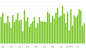
I like to track our family’s earning/spending habits, and it has come in handy a number of times. But every once in a while fun patterns emerge. So I present to you now one such data mystery. This is a plot of our spending on <something> each month. The values have been removed, because mystery. Anything jump out at you?
To me, there are two months that appear as outliers: January 2016 and September 2013 have noticeably less spending than other months. Perhaps we’d like to know why.
What if I told you this was a plot of how much we spend on food each month (groceries, restaurants, etc.)? Could you guess why there would be two months with so little spending? It’s not as if we can just decide not to eat…
You might guess those were months we ate out less, since dining out is often more expensive than buying groceries, and you’d be partially correct. But those values are low enough that we spent awfully little on groceries too.
Turns out that those were the two months immediately following the births of our two kids. So we definitely were not eating out at restaurants very much. And both times we had prepared in advance by stocking our freezer, so we had less need for big grocery shopping trips.
But there’s a second pattern here. Each of those two low-spending months was followed by a very high-spending month. Can babies explain that too? Of course they can’t, because babies can’t talk. But they are part of the explanation. We like to travel, and during the final few months of pregnancy it is hard to do so. So when our kids were old enough (6 weeks or so) we took big trips and dined out quite a lot, leading to two of our highest-spending months in the series.
Trying to predict the decisions of the Supreme Court is probably as old as the Court itself. And with many high profile cases being argued lately, the Court has been in the news a lot (see here, here, and here). People have developed statistical approaches such as {Marshall}+, and there is even a Fantasy SCOTUS league where anyone can make their predictions. Here’s a great story about some of these efforts and how well they do.
Commentators often stress how important oral arguments are in getting a sense of how the justices will vote. But statistical or machine learning approaches have focused on the case history rather than the oral argument. I’ve changed that, building what I believe to be the first machine learning Supreme Court predictor that uses oral argument features.
My model predicts outcomes correctly over 70% of the time and provides a probability for each prediction. If this was a spam filter that accuracy would be terrible, but for a Supreme Court predictor, it’s pretty great.
And I’ll toot my own horn for a second and say that I did all this from start to finish in three to four weeks.
 You can find my predictions of current and historical cases at courtcast.org. I haven’t had much time to make an awesome front-end, so you have to enter the docket number of the case. But there are links to the Supreme Court website to find the docket numbers. And hopefully my site doesn’t crash if it actually gets some traffic.
So far in this session I’ve correctly predicted the five decisions released. And here are some of my predictions for the high-profile cases argued so far:
– For yesterday’s Affordable Care Act case (14-114) my model predicts a 60% chance the ACA will be upheld.
– For the Arizona gerrymandering case (13-1314) I predict a 75% chance that Arizona will win and gerrymandering will continue.
– For the Abercrombie & Fitch headscarf case (14-86) I predict a 69% chance that the Equal Employment Opportunity Commission will win.
Perhaps the most impressive part of this is that my accuracy is so high while completely ignoring any information about the case itself other than the way the justices act during arguments. My model doesn’t know what kind of law it is, or which district court the case came from, or who the lawyers are. It only really knows how the justices ask their questions.
Here are some technical details about the model and features:
I downloaded all of the transcripts of oral arguments from 2005-present from the Supreme Court’s website, converted them from pdfs to text files, then then did some natural language processing on the arguments to extract a set of features I thought might be important. More about those soon. I then built a machine learning classifier to predict the case outcome using only the features I extracted from the oral arguments of that case and trained it on cases argued prior to 2013. I use a linear SVM classifier (although logistic regression also works well) evaluated with cross-validation. I then tested the model by trying to predict the cases from 2013-2014, and correctly predicted the outcome over 70% of the time.
I’m not predicting individual justice votes here, only the case outcome. Because in practice a 9-0 loss is just as bad as a 5-4 loss.
The features I selected are the relative number of words each justice says to each side, the relative sentiment (positive/negative) of those words to each side, and the number of times each justice interrupts each lawyer, along with a few others. The interruptions are my personal favorite and I’ve never heard anyone suggest them as an indicative feature before.
The intuition here is that in general, if a justice asks more questions they are trying to poke holes in your arguments. If their questions are more negative that is bad for you. And if they cut you off they disagree. Anthony Kennedy seems to be the exception here: if he asks you more questions that is bad, but if he interrupts you more that is good!
I also only track five justices: Scalia, Kennedy, Roberts, Breyer, and Ginsburg. These are the five justices for whom I have complete data from 2015-present. I could use Justice Kagan, for example, but would have less data for her on which to train the model. These five comprise the ideological center of the court and one from each flank. Since the justices votes are highly correlated, this gives a lot of power to account for ideology in prediction without having to follow all nine justices.
The obvious next step is to use the predictions of {Marshall+} as a prior probability and combine it with the oral argument data to give a posterior estimate of the outcome.
You can view, download or modify my code from my github page.
Nine monkeys flipping coins
Imagine that instead of nine highly intelligent justices, the Supreme Court consisted of nine robed monkeys flipping coins. Cases are decided by the majority of coins showing either heads or tails. So how often will your favorite monkey justice be in the majority, purely by chance? Can we explain the actual win percentages for each justice we saw before?
First let’s assume that every coin is equally likely to come up heads or tails. If the other eight justices are evenly split 4-4 then you win every time, because you will cast the deciding vote. And if the other eight are not evenly split then you win as long as you side with the existing majority, the chance of which is just ½. The chance of a 4-4 split is 70/256 (see box), so the probability you are in the majority by chance alone is 70/256 + 1/2 * (1-70/256) = 0.6367188.
But we know that each justice has their own ideological disposition. So now let’s imagine that each monkey flips a biased coin, where the amount of the bias towards heads/tails represents how conservative/liberal the justice is. The Supreme Court Database has conservative/liberal classifications for each decision, and I used the individual votes on all cases since 2010 (when Elena Kagan was appointed) to calculate a coin bias for each justice.
Now how often a particular coin-flipping monkey should win will depend on the biases of the other eight coins. The calculation will be similar to before, but we need to know three things: our own coin’s bias, how often the other eight will be split evenly, and how often the majority will be conservative/liberal (it won’t be 50/50). The latter two can be calculated using a probability distribution called the Poisson-binomial distribution.
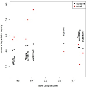
Sorting the current justices by their ideological bias, I’ve plotted both their actual win percentages (ignoring unanimous decisions) and their expected win percentage. The naive fair coin expectation is shown as a grey line. One observation is that some justices (Kennedy, Roberts) win much more than they are expected to by chance while others (Breyer, Ginsburg) win less often than they should by chance. We’ll return to this in a moment.
The other observation is there is a huge ideological gap between the conservative and liberal wings of the court. But in this respect is the court any more divided than it has been in the past?
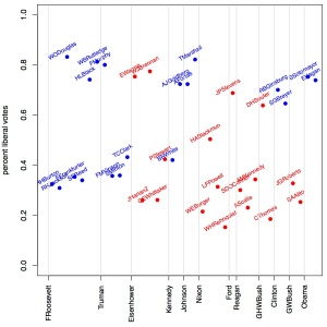
Not really. I used the full data set to calculate ideology scores for every justice since 1946 and plotted those scores, color coding the justices by the presidential party who appointed them as I did for overall win percentage previously. It is clear that there has always been such an ideological gap, so the current one is nothing special. What I find interesting is that both Roosevelt and Eisenhower appointed justices of both ideologies.
So why do some justices do better/worse than the biased coins expect? The reason for this is because the justices are not completely independent like our imaginary coins are. Justice Scalia and Justice Thomas are both conservative justices, but they are not randomly conservative, rather tend to be conservative in the same way, and therefore on the same cases. In addition, justices may be persuaded by the arguments of their peers. We can estimate the correlation coefficients between each pair of justices to reveal how much more alike/different their voting patterns are than expected by chance, again taking into account their biases.
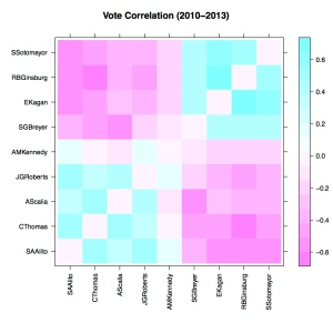
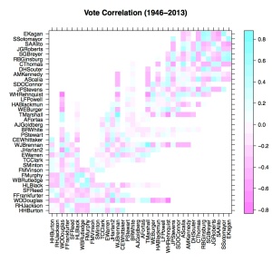
The correlation matrix of the current justices, sorted by ideology, reveals that the current court is highly structured. In fact the only non-significant (p > 0.05) correlations are between Justice Kennedy and each of Justices Thomas, Scalia, Roberts, and Breyer. This is I think what makes this court seem so divided, that nearly every member is strongly correlated (either positively or negatively) with nearly every other member. It also means that the court votes in blocks much more than coins would, making Justices Roberts and Kennedy more likely to be a deciding vote and thus increasing their win percentages.
As an aside, it is interesting to note that the correlation between Justices Kennedy and Scalia is actually very slightly negative, meaning they have disagreed recently a bit more than ideology would suggest.
Are the current justices more highly correlated than in the past? We can examine correlation coefficients for all members of the court since 1946, sorted by appointment date. By far the strongest negative correlation in this period was between William Douglas, the longest-serving member of the court’s history, and a young William Rehnquist. The strongest positive correlation was between William Brennan and Thurgood Marshall. So while Justice Ginsburg often agrees with Justice Kagan and rarely does so with Justice Thomas, those correlations are certainly not the strongest in the court’s recent history.
But the current court does seem qualitatively to have more/stronger correlations (higher density of darker colors) among justices than in the past. [We could do something more quantitative to test this, but this post is already too long as it is.] Now this doesn’t mean the court was never divided before, because it certainly was. Over time the correlations in voting patterns among court justices started numerous but moderate, became weaker for a time, and then became strong and plentiful leading to the court we see today.
The winningest Supreme Court justice
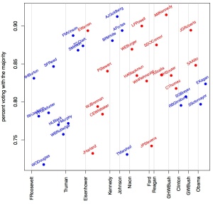
Which Supreme Court justice wins (votes with the majority) the most? Among the sitting justices I suspect it should be Anthony Kennedy, the ideologically median vote on the court. As the swing vote, he should win most of the 5-4 cases. But how does this compare against former justices? To test these ideas I downloaded the justice-centered data from the Supreme Court Database, which has voting records dating back to the FDR administration. For each justice I calculated the proportion of their votes that were in the majority opinion, a kind of ‘batting average’ for votes. I plotted these proportions, listing the justices chronologically by their appointment date. The justices are color-coded by the political party of the president who appointed them, and these presidents are listed on the x-axis.
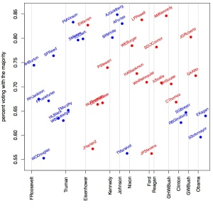
The winningest justice is indeed Anthony Kennedy, not just on the current court but in the entire dataset. He has won an astounding 91.5% of his cases. But it turns out that the biggest winners aren’t all swing votes. Arthur Goldberg was a solid liberal, replacing the much more conservative Felix Frankfurter. This tipped the balance of the court from a conservative to liberal majority. Goldberg served only a few years, as did Abe Fortas who replaced him. Neither were swing votes, but have high percentages because they served short terms on courts in which they were solidly in the majority. You might also notice that on the current court there are no justices with percentages much below 80%, and this wasn’t true in the past. I discussed the reason for this in a previous post: unanimous decisions. This court often votes either all together or narrowly divided, and in 2013 the court voted unanimously in nearly 2/3 of their cases! If we think that unanimous decisions don’t tell us much about how the court divides, then we can consider at only the cases in which at least one justice dissented. In probability this is called conditioning on the case not being unanimous. Here is the same figure after conditioning.
Everyone’s win percentage drops, with some reaching as low as 55%. And the current court then looks no different than previous courts. It’s also especially obvious in this second figure just how much lower the winning percentages are for the Democratic-appointed justices on the current court are than their Republican-appointed colleagues.
METHODS: The csv formatted justice-centered data from the Supreme Court Database has problems because the case names also contain commas. So I read in the Rdata instead and produced a tab-delimited text file. I then wrote a Python script to calculate the win percentages for each justice and save them to a text file, which I could read back into R and produce the figures.
 23andMe is one of several companies that offers direct-to-consumer genetic testing. They use your genotype to draw conclusions about both your ancestry and health-related risk factors. Last year, the FDA forced 23andMe to stop marketing itself as a provider of health-related genetic tests.
 They are afraid that people will be provided with incorrect information regarding their risks over disease. Overestimating risk can make people overly concerned and demand additional unnecessary procedures from their physicians. Underestimating risk can make people feel complacent and not take the appropriate precautions.
I bring this up now because the FDA recently wrote a blog post about their decision to stop 23andMe from providing such results. While I share their concerns and am glad the FDA has taken interest, the methods they describe and the justification is pretty shaky and would certainly not stand up to peer review. Here is their experiment and results:
In 2010, at the behest of Congress, investigators from the U.S. Government Accountability Office purchased direct-to-consumer (DTC) genetic tests from four different companies—including 23andMe—and submitted two samples of their DNA to each company to receive risk predictions for 15 common diseases. The results varied across the four companies. One investigator was told that he was at below-average, average, and above-average risk for prostate cancer and hypertension. In some cases, the risk predictions conflicted with an investigator’s actual medical condition.
The main problem here is that if you are interested in accuracy, comparing methods against each other is a terrible way to assess it. Even if they all agreed, they could all still be wrong. And there are tons of reasons why they might not agree.
Problem #1: There are two steps to ensuring accuracy here. One is making sure that the genotyping itself is accurate. The other is that the conclusions being drawn from the genotype results is accurate. 23andMe has provided pretty solid evidence that their genotyping methods are quite good (although here is an analysis of their multiple-testing problem plus a little bit of melodrama). They will make some mistakes, but they will be rare. I don’t know about the other companies tested, but let’s just assume they have very high quality and focus on the differences in interpretation.
Problem #2: Different companies sequence different parts of the genome. We aren’t yet at the point where everyone is sequencing their entire genome; each company uses a different way to genotype some subset of the genome. If the companies have different information, obviously their results should differ.
Problem #3: What we know about disease risk is constantly changing. These companies rely on papers published by scientists to help them interpret your genotypes. As new research emerges, these results can drastically change. But incorporating new results into their predictions is not automatic, so this is another easy way in which results could be different.
Problem #4: Two samples? Really? Is the FDA seriously making its decisions based on a study with a sample of size two? The irony of this is that the whole process of inferring disease risk from genotypes is a statistical one, yet to challenge it the FDA says “Statistics? Meh.”
Problem #5: They report how for some diseases the companies failed to provide the same risk analyses. They did not report the many other diseases tested in which the companies all did agree. This is called cherry-picking results. You have to show that the number of discrepancies you observe is significantly different from a null expectation using a statistical test.
Problem #6: “In some cases, the risk predictions conflicted with an investigator’s actual medical condition.” This is just silly. 23andMe provides risk information, not diagnosis. If I tell you that your chance of rolling a die and getting a 1 is 1/6, and you indeed roll a 1, does this mean my prediction about your 1-risk was wrong? Nope. That’s just how probability works.
I’m glad the FDA has taken an interest in the issue of direct-to-consumer genetic testing. It is important both to protect consumers from false claims as well as ensure they have accurate medical information. But if I were a reviewer of this paper I would summarily reject it. Of course it’s not a paper, it’s a blog, but it is targeted at the general public and on the surface makes their case seem much more persuasive than it actually is.
Choosing a baby’s last name
Whether I’m ready or not, I’m going to be a father in about a month.
My partner and I have spent a lot of time thinking about what to name our baby, but we have given every bit as much thought to our baby’s last name (surname) as her first name.
Surnames are funny things. They are fossils, names frozen in time from when people first started using them a few centuries ago. Often they are of the job that someone used to do (Miller, Baker, Smith) but are of little relevance today. So maybe they don’t need to be preserved in stone.
Traditionally, a woman adopts her husband’s surname through marriage, and so the baby simply takes the father’s surname as well. This practice of name adoption is a relic from when women were considered property. Today, the practice still gives preference to the man’s name over the woman’s, even if no one thinks of women as property anymore. My partner and I have no interest in any of this, so she has retained her own name.
That leaves us with two last names: Nasrallah (mine) and Resnick (her’s). Which one should the baby get?
Bad Option 1: Use one name
Some parents in this situation give the baby either the father’s or the mother’s name, like Lorem Ipsum Resnick. In a stable two-parent household I think this is a bad idea, because it creates a disconnect between the child and one parent.
Bad Option 2: Make one a middle name
Similarly, using one of the parents’ last names as the child’s middle name (Lorem Resnick Nasrallah) implicitly gives one name precedence, since no one really cares about middle names anyway. And often it is the mother’s name that gets the short end of the stick in these situations.
Bad Option 3: Hyphenate
Other parents have chosen to give the child an enormous hyphenated last name: Lorem Ipsum Resnick–Nasrallah This solves the equality issue, but is an unsustainable strategy. When Ms. Resnick-Nasrallah meets Mr. Miller-Smith and has a baby, will the baby be Resnick-Nasrallah-Miller-Smith?
The Solution: Use part of both!
The answer is to use only a part of each of the parent’s last names. It’s like a surname mash-up.
Using a single breakpoint, our favorite new name combination is Nasralnick. Another excellent option would be Resrallah, which is especially fun if said in a Scooby Doo voice.
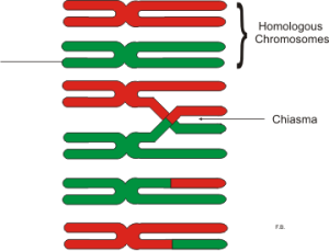
This name-recombination approach also appeals to me because of its relationship to biology. A child gets exactly half of their DNA from their mother and half from the father. Why shouldn’t the child’s name be the same? The crossing-over of names also has a connection to chromosomal recombination during meiosis.
The beauty of this is that you can point to the parts of the child’s name and say “This part is from your mommy, and this part is from your daddy.”
Other couples may have names that don’t recombine quite as well. In these cases more than one recombination breakpoint might be necessary (Resralnick, for example). In the worst case scenario, the letters of the two names can be used to create an entirely new name from the pieces (like Rascal). This option gives you a lot of freedom to be creative.
Why Not?
Many people worry that having a different name from your child will cause problems when flying with them. This is untrue. Simply keeping a copy of the birth certificate will quickly resolve any potential issues.
Others worry it will make their child feel different from other kids. It won’t matter what last (or first) name you give to your child: other kids will find some way to tease them.
Finally people tell me “We want our family to all have the same last name.” No problem: mom and dad can adopt the newly created name as well. Then the family can take on a new unified identity together.
Editor’s Note: the baby will probably not be called Lorem Ipsum.
How to choose a health insurance plan
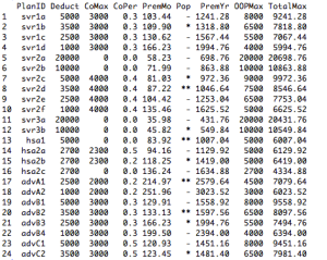
I recently had to buy independent health insurance, and I was immediately overwhelmed with my options. From just one provider I was given quotes for 24 different plans. I needed something to help me make some sense of them all.
There are a few key features of all health insurance plans:
1. The monthly premium you pay, for the privilege of doing business with an insurance company.
2. The deductible, or the amount you will have to pay for expenses before the insurance company begins to pay for anything.
3. The coinsurance percentage, or the proportion of costs after the deductible you will have to pay.
4. The coinsurance maximum, or the total amount you could possibly have to pay after you’ve met your deductible.
I made a table of all 24 plans and these four features, using the premiums I was quoted online. I calculated some other features, such as the Out-Of-Pocket maximum (deductible + coinsurance max), the annual premium, and the TotalMax cost to me (OOPMax + annual premium). Having the data in this format will help us to visualize the plans better.
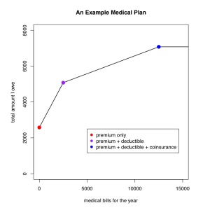
Consider a plan with $2500 in annual premiums, a $2500 deductible and 20% coinsurance up to a maximum of $2000. I’ve plotted your total health care costs (y axis) as a function of your total medical bills for the year (x axis). Even if you have no medical bills, you still pay $2500 in premiums (red dot). You then pay for all medical bills until you reach your deductible (purple dot). Having met your deductible, you now pay only 20% of further expenses (shallow line) until you have paid an additional $2000 (blue dot). At this point you have incurred $12,500 in medical bills for the year, and have paid $7000. The line is flat after this, because you have reached your coinsurance limit, and the insurance company will pay the rest in full.
The lower the line is, the less you will pay.
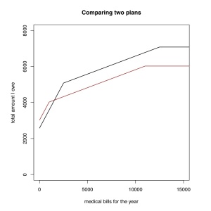
Let’s compare this plan to a second plan, shown in brown. This second plan has a lower deductible ($1000) but a higher annual premium (~$500). You can see that if you have very few medical expenses the first plan (in black) is better because the second one has a higher premium. But if you have more than about $1500 in bills you would pay less with the second (brown) plan because of the lower deductible. For most people the plan in brown is probably a better choice.
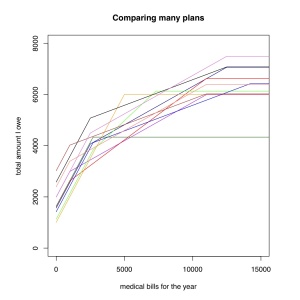
Now comparing all 24 plans this way would be pretty messy. So I decided that under no circumstances could I pay more than $7500 in total for the year (premium + deductible + coinsurance). That way, even if something catastrophic happened, I’d still only pay $7500. This eliminated plans with really high deductibles (as high as $20,000!) and coinsurance, leaving only 11 plans.
See how our first plan (in black) compares to all these other plans? It is one of the most expensive plans, regardless of your medical bills. Unless it offers something else the others don’t, we can discard this plan. The plan in dark green stands out as by far the cheapest plan if you have a lot of expenses, so if you are guaranteed to have $10,000 in medical bills, and to do so every year, maybe that is the plan for you.
So to pick one plan, we really need to have a sense for how likely are we in to incur different amounts of medical bills. One way to do this is intuitively. Over the last ten years I have rarely needed to go to the physician at all. There was one snowboarding accident where I broke my collar bone, but I’m not snowboarding this season. So I want a plan that has low premiums, and I’ll take the money I save on premiums and put it aside in case I do actually have some expenses. So for me, the two main criteria are (1) low overall maximum cost (I weeded these out already), and (2) low premiums.
I picked the plan in yellow. It has the lowest overall cost, while having one of the lowest overall annual maximums. If my costs end up being $3500-6000 I probably could have done better with another plan. The light green plan would have been another good choice for me.
Now if you are more mathematically inclined, you could assign a probability distribution for your anticipated medical costs, perhaps based on previous years expenses, and calculate the Expected cost under each plan. But if you don’t know what this means, don’t sweat it. Given how little data each of us has on our own expenses, you might just be better off using intuition. I tried this approach, and it didn’t change my decision.
Now, these plans DO differ in some other ways. The plan I chose gives me virtually nothing besides preventative care until I hit my deductible. Others give you cheap primary care office visits. Others low cost prescription drugs. Some, including the one I chose, allow you to contribute to a Health Savings Account (HSA), which is like an Flexible Spending Account (FSA) but better. So those factors need to be carefully considered as well. For example, if you regularly need prescription drugs, having a plan that provides them with a small copay or at least has a separate drug deductible may be of real value to you.
But this approach at least this gives you a way to visually compare the overall costs of healthcare plans for lots of possible scenarios of medical bills.
Election Lines and Name Frequencies
I voted this morning. Far more interesting to me than anything on the ballot was the line for voting. Or rather the four lines.
To obtain a ballot you stood in a line devoted to a portion of the alphabet. Last names beginning with A-D, E-K, L-R, and S-Z each had their own line. I stood waiting in my line (L-R) behind 7 or so people, and in the entirety of my time in line not more than a single person entered any of the other lines.
Perhaps the nice volunteer handing out ballots for L-R was just very slow. But another possibility is that the way names were grouped created an imbalance of line lengths. I can think of lots of last names staring with L-R, but fewer for E-K for example. This could be important because many people may be discouraged from voting if lines are too long.
To test whether or not the groupings they chose were reasonable, I downloaded some of the 2010 census data on names. They have compiled a file of last names and how many times they occur. This file only includes names that have appeared nationwide at least 100 times, so extremely rare names are not represented.
I counted the number of individuals with last names beginning in each of these four groupings, and the proportion of names falling in each grouping are shown in the bar plot. As you can see there is a clear overrepresentation of people whose last names start with L-R, and an underrepresentation of names starting with S-Z.
But these census data are nationwide; I was unable to find data specific for Durham county (North Carolina). It is possible that the distribution of names in Durham is different from that nationwide. The reason is the ethnic composition of the area.
For example, in California where the Asian population is very high, I would expect the frequency of names beginning with S-Z to be very high, because there are many Chinese surnames that begin with W, X, Y, and Z. Durham county, and especially my precinct, is a largely black community. If the last names of blacks in Durham tend to begin with L-R more than the national average, this could magnify the already existing bias.
Whether or not this is true is not an easy question. The 2010 census data show that some names are very indicative of ethnicity (see the table reproduced here). For example, If your last name is Yoder the chance you are white is 98.1%. There are many such names that correlate closely with ethnicity for whites, Asians, and Hispanics. But among blacks the names are not as telling. Besides Washington (89.9%), Jefferson (75.2%), and Booker (65.6%), there is no name in the dataset where the probability of being black given that you have that name is over 60%. This is not at all true for the other ethnicities. This means that black names are perhaps more likely to represent the national average than are those of other ethnicities.
Perhaps most interestingly to me, this was the kind of problem that would be easier addressed in an analog fashion than a digital one. If I only had a Durham county phone book, I could simply count the pages of names A-D, E-K, L-R, and S-Z. This would have controlled for geography and demography, and would have probably been faster too!
Just how much do I dislike 90’s music?
Most people seem to love the music they grew up with. Not me. I spent junior high, high school, and most of college in the 1990’s, yet I strongly dislike the music of that era. Now this is not a post about whether or not I am right that the music of the 90’s was terrible (it was), but about how to quantify just how much I dislike that music, and maybe learn something about myself in the process. To Science!
 I exported a playlist of all the music in my iTunes library, which at the time of export included 11080 songs (excluding classical and spoken recordings). The file created contains all the information about each song in your library.
I plotted a histogram (shown in pink) where each bar represents the number of songs in my music library that were released that year. There are two major peaks: one in the past 5-10 years, the other around 1960, with a huge valley between them that bottoms out around 1990.
Notice there is another deep trough between 1941-1945, corresponding to the drastically reduced output of the recording industry during the Second World War.
I suspected those two big peaks were for different reasons. If we remove all the jazz from the collection (shown in blue), the size of the earlier peak is greatly reduced.

What I found a little surprising was that the real bottom of the trough occurs between 1988-1995. This is a bit earlier than I had guessed it would be. Maybe I dislike the late 1980’s and simply didn’t realize it.
If we look at only the jazz songs (shown in red) the peak around 1960 is quite strong, but it also becomes apparent that the peak in the late 1930s is due almost entirely to jazz recordings. In particular this is due to my fondness for stride piano. And apparently I didn’t much care for the jazz in the 1980’s.
1. Music ownership is equivalent to liking. Partly true. I don’t own things I don’t like and actively remove things I don’t like. But I don’t like everything I own equally. I don’t have ratings of every song, but I expect the distribution of music I “love” is a bit more flat, with great music from all eras.
2. There are no underexplored eras. You might say “Well, you just haven’t heard the really awesome music of the 90’s.” Possible, but unlikely. I’m very active about seeking out new music.
3. With the exception of WWII, the number of records released has generally increased over time. In addition to this, many older recordings have never been released in electronic formats. This creates an overrepresentation of recent eras.
4. Years are representative. Automatic music databases often will provide you with the re-release date of music instead of the original release date. This is important because it might otherwise bias the results, particularly if you have a lot of music that was originally released on LP. I am very diligent about making sure that the years of all my songs are correct.
The hardest part of doing this to your own music library is getting the data in the right format. Here is the R script I used to make the plots, preceded by a lot of comments on how to do some find-and-replaces to get the data so R can read it. Happy exploring!
A Comprehensive Meat Classification System
How much do you think about meat? Maybe you think a lot about the ethics of meat eating. Perhaps you are highly conscious of the healthiness of different types of meats. Or maybe you just daydream about how delicious meat is. However much you think about meat, it isn’t as much as Josh Miner does, I’d wager.
He has created a 4-way Venn diagram in which he looks at four properties of meat: deliciousness, healthiness, ethicality, and ‘realness’ (how unprocessed it is). Below is his diagram, complete with his examples of each of the 15 possible partitions of those four categories. One example I thought I could improve upon was for his Group #6: a meat that is delicious and real (not highly processed), but unhealthy and very unethical: foie gras! Here are Josh’s figure and examples, reproduced with his permission. Enjoy!

Examples:
1: A real food that is unpalatable, unhealthy, and immoral (ex. fatty, tough, nasty piece of industrially-produced chicken)
2: An edible food-like substance that is delicious, but unhealthy and immoral (ex. McDonald’s chicken nugget)
3: An edible food-like substance food that is unhealthy, unpalatable, but moral (this is a bit of a tough one — pre-cooked, highly-processed skinless hot dog made with local, grassfed beef but that is high in fat and sodium and that for whatever reason just doesn’t taste very good)
4: A real food that is unpalatable, unhealthy, but still moral (ex. the same fatty, tough, nasty piece of chicken from #1, except that the chicken itself was truly ‘free-range’ and raised on a small-scale farm located within a couple hundred miles of where it was purchased)
5: A real food that is unhealthy, but still delicious and moral (ex. same thing as #4, except now it is a nicely-prepared, deep-fried wing or thigh)
6: A real food that is delicious, but unhealthy and immoral (ex. fatty rib-eye steak from industrially-raised beef)
7: A real food that is delicious, good for you, but immoral (ex. a nice, grilled, industrially-raised chicken breast)
8: An edible food-like substance that is delicious and good for you, but immoral (nicely grilled highly-processed, low-fat, low-sodium chicken apple sausage made with industrially-raised chicken)
9: An edible food-like substance that is good for you but tastes bad and is immoral (ex: prison loaf or pink slime — and yes, to all you skeptics, both of these edible food-like substances will give you plenty of health-promoting macro- and micro-nutrients; if you were stranded on a desert island, you’d be lucky to have either of these as sustenance, especially if they were fortified with Vitamin C and could ward off scurvy)
10: An edible food-like substance that is delicious and moral but unhealthy (ex. hot dog from #3 except that this one tastes really good)
11: An edible food-like substance that is delicious, moral and healthy (ex. hot dog from #10 that is low in both fat and sodium — I had about 10 cases of these made for me using the trim from the last steer we bought and still have some of in my freezer right now; they are a great option for the National School Lunch Program)
12: THE HOLY GRAIL: a real food that is delicious, moral and healthy (ex. just about any pasture-raised, humanely-slaughtered piece of meat that is well-prepared; probably the quintessential example would be something wild that you’ve shot and dressed yourself, like deer — bonus points if it is also a destructive invasive species like feral pigs)
13: A real food that is good for you and moral, but that doesn’t taste good (ex. the chicken from #4, except now it is an over-cooked, under-seasoned chicken breast)
14: A real food that is good for you, but doesn’t taste good and is immoral (ex. chicken from #13, except that the chicken was industrially-raised)
15: An edible food-like substance that is good for you and moral, but doesn’t taste good (ex. highly-processed, unseasoned, low-fat chicken apple sausage from happy, local, free-range chickens)
